KEREN NADLAN
PROJECTTYPE
brand identity · visual design · website
Overview
Keren Nadlan specializes in urban renewal and redevelopment in high-demand areas of Tel Aviv, focusing on the construction and revitalization of residential buildings.
The company has extensive experience with Tama 38/2 projects, which involve demolishing aging buildings and constructing new ones in their place.
My Role
I led the visual and digital design, developing a cohesive brand language and applying it across a responsive marketing website and supporting digital assets — ensuring consistent brand expression throughout.


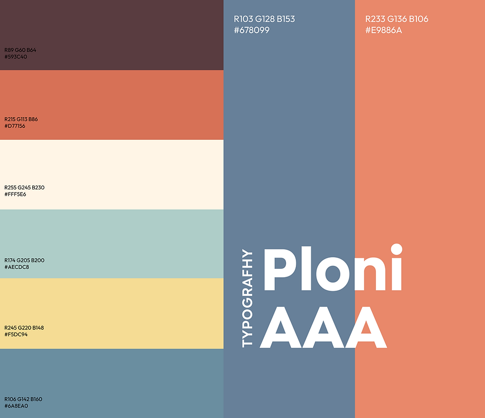
Design Approach
The design process began with an illustrated language created for residential floor plans and maps, using warm colors and characters to bring a sense of life into the spaces. I extended this visual language into the website by adopting the color palette and adding subtle animated characters to create a warm, family-oriented atmosphere.
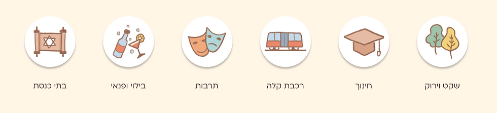
To maintain consistency, I collaborated closely with an illustrator and guided the creation of additional characters based on my direction. Alongside this, I developed a custom icon system representing the surroundings of each project forming a cohesive visual language that connects location, information, and the human experience of home, not just real estate.

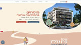
Live Site
Mobile Responsive Design


Social Media
Social media visuals aligned with the brand's visual language for a cohesive, unified feed.


Up Next

AHAVA